Lawscot Foundation
A Scottish charity removing financial barriers for the next generation of legal professionals.
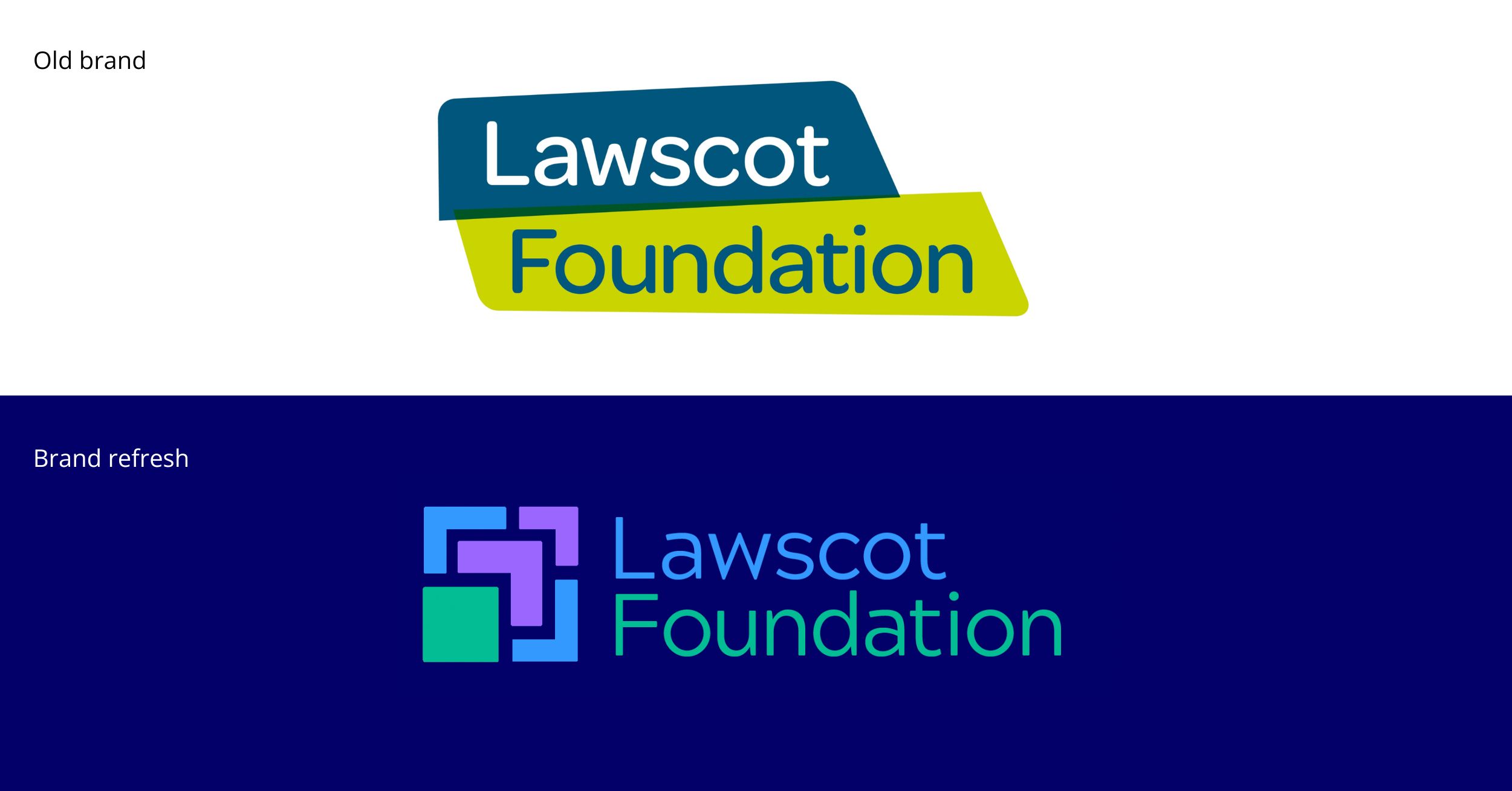
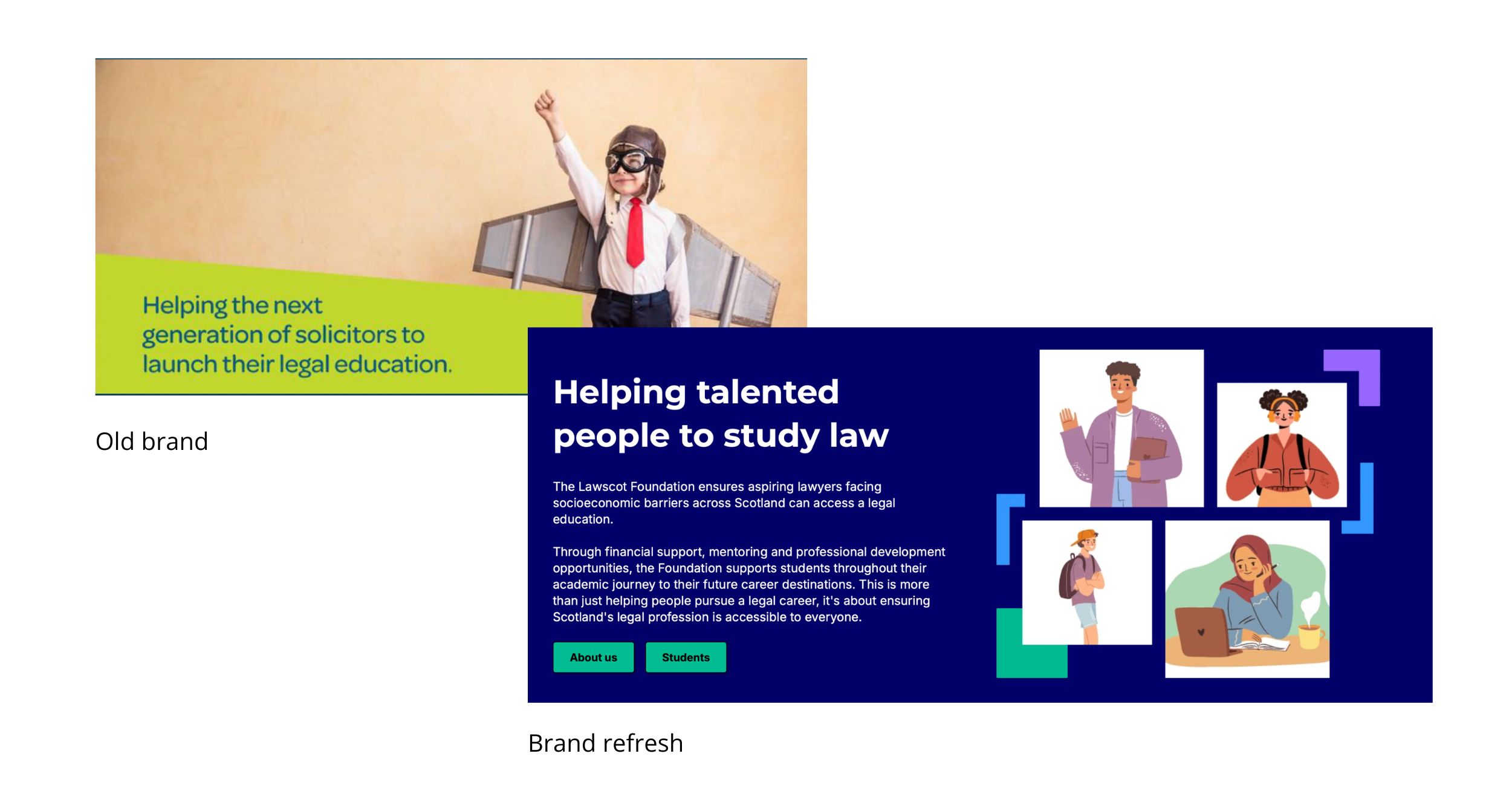
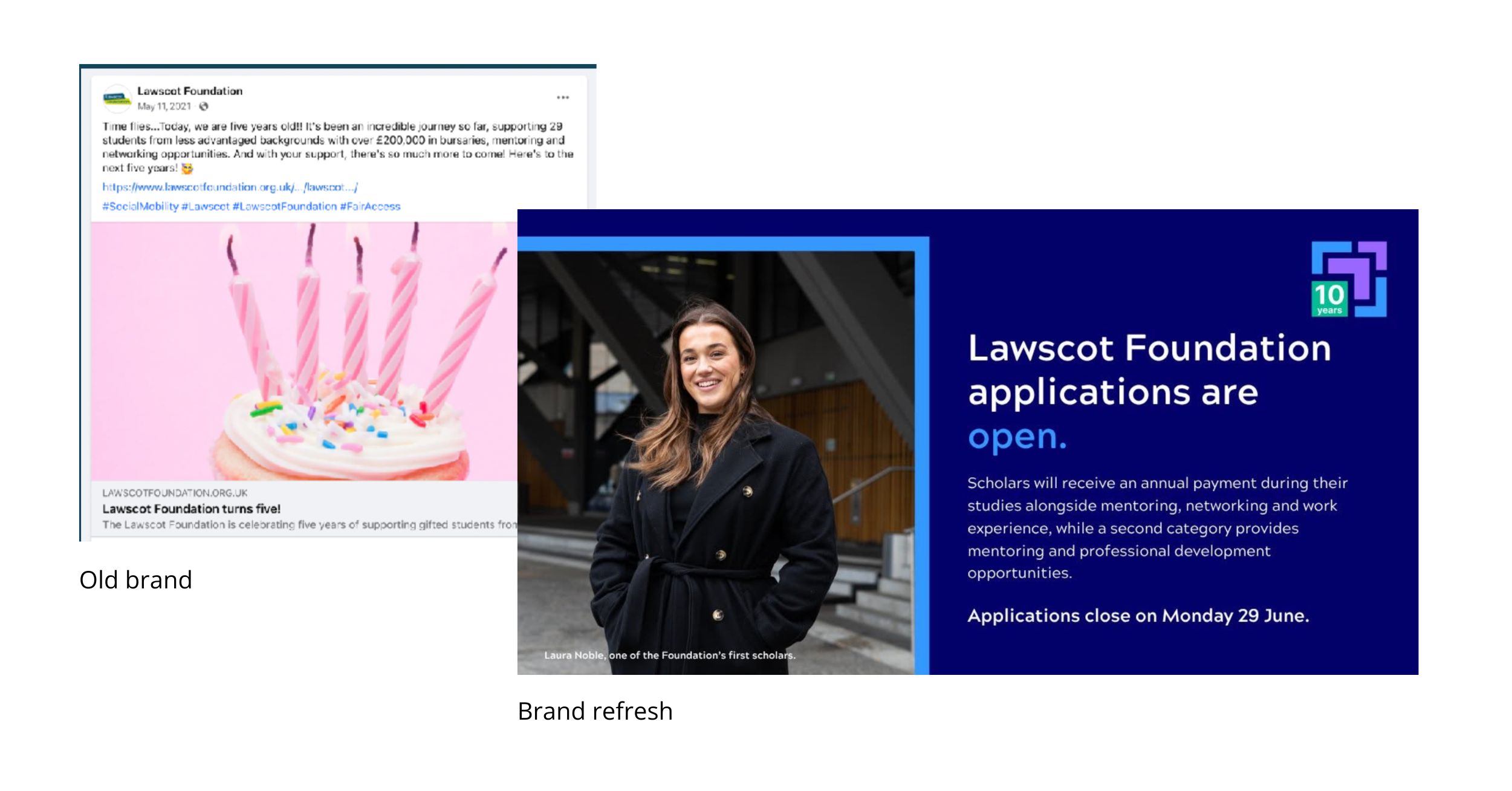
The Lawscot Foundation exists to ensure that talent, not money, determines who gets to work in law. A powerful mission. But the brand wasn’t telling that story. It felt disconnected from the young people it was trying to reach, formal where it needed to feel accessible, distant where it needed to feel like it was on their side.
The brief was to change that from the ground up.
We started by listening. A brand audit across every channel, one-to-one interviews with the board, current students and the law firms that mentor them. What came back was clear. The people inside the organisation knew exactly what it stood for. The brand just wasn’t showing it.
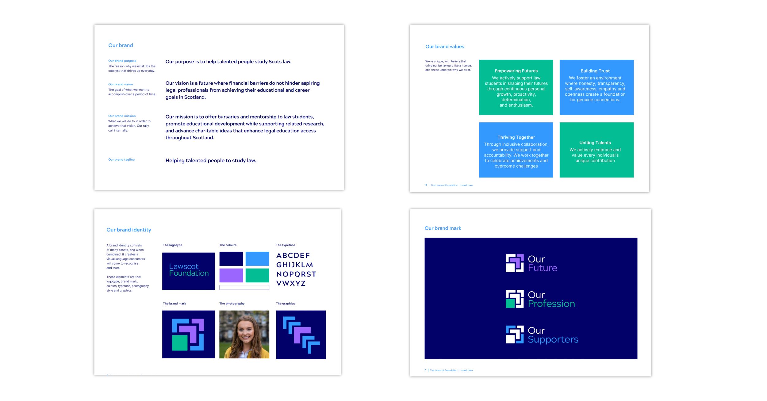
From those conversations, we built the foundations. Purpose, vision, mission and values, all rooted in what the organisation actually believes rather than what sounds good on a website. A tone of voice that speaks directly to young people, warm, plain, ambitious, without a hint of the legal formality that can make this world feel closed off to exactly the people Lawscot wants to reach.
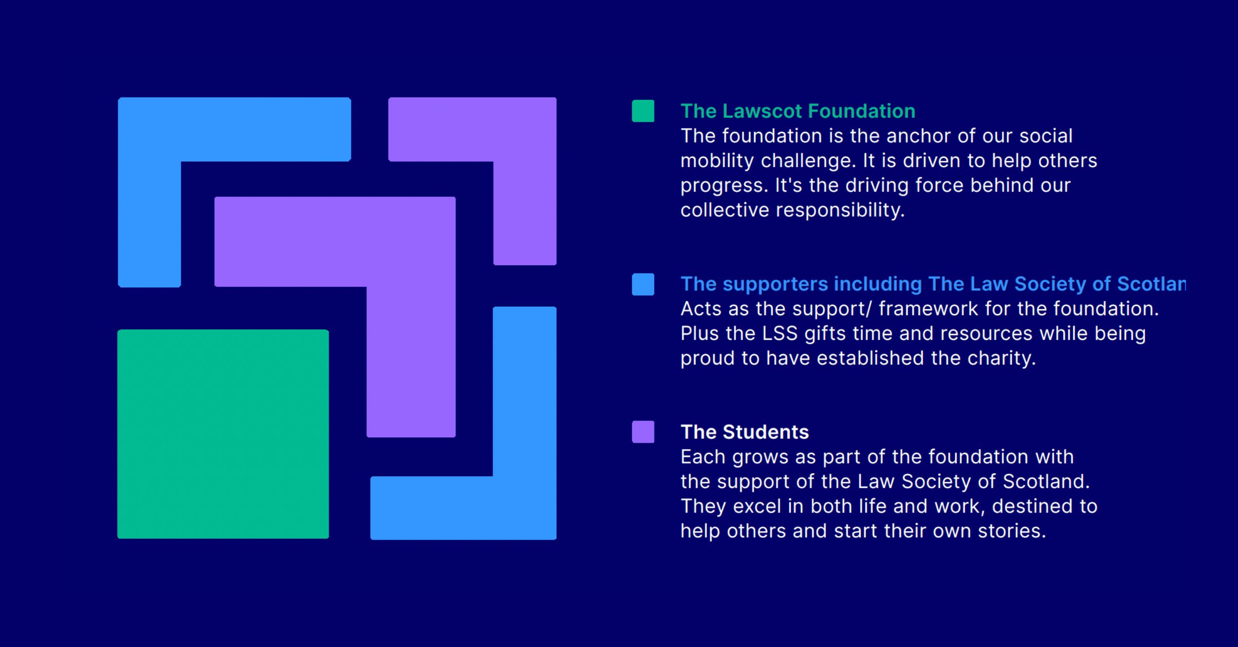
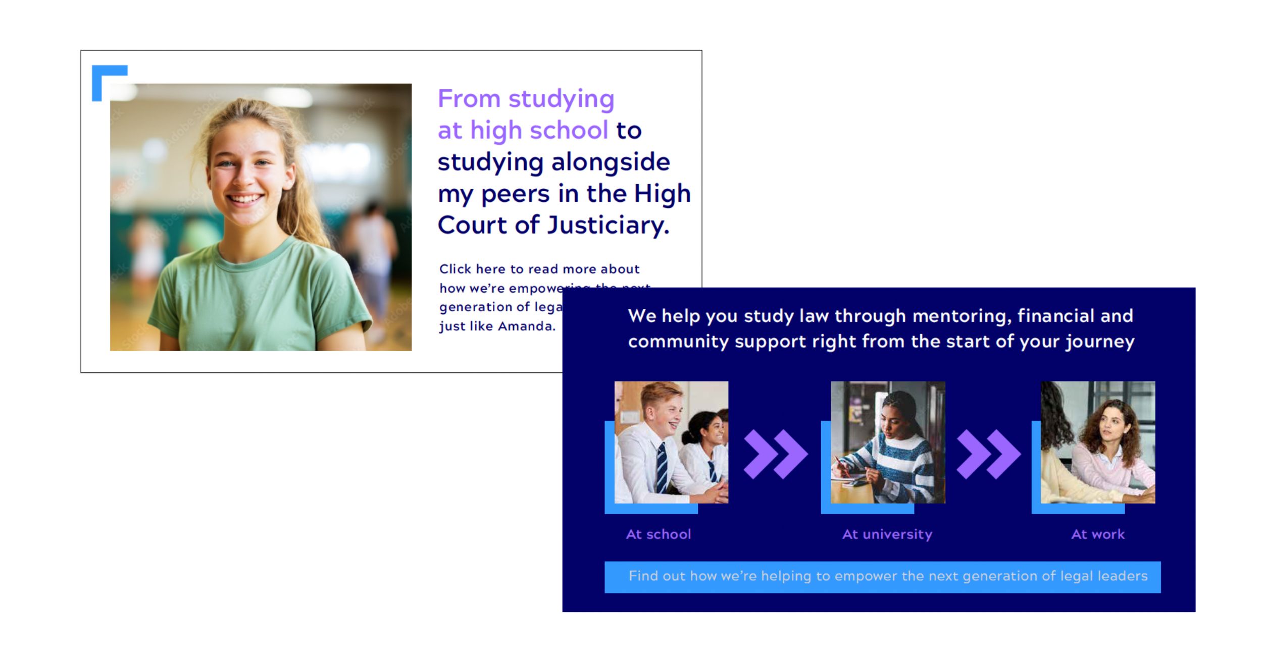
The brand architecture came next. Three interlocking parts, the Foundation as the anchor of the social mobility challenge, the Supporters including the Law Society of Scotland providing the framework and resource, and the Students, each one growing as part of the foundation, destined to help others and start their own stories. The visual system reflects that relationship. Shapes that connect, overlap and build on each other, never standing alone.
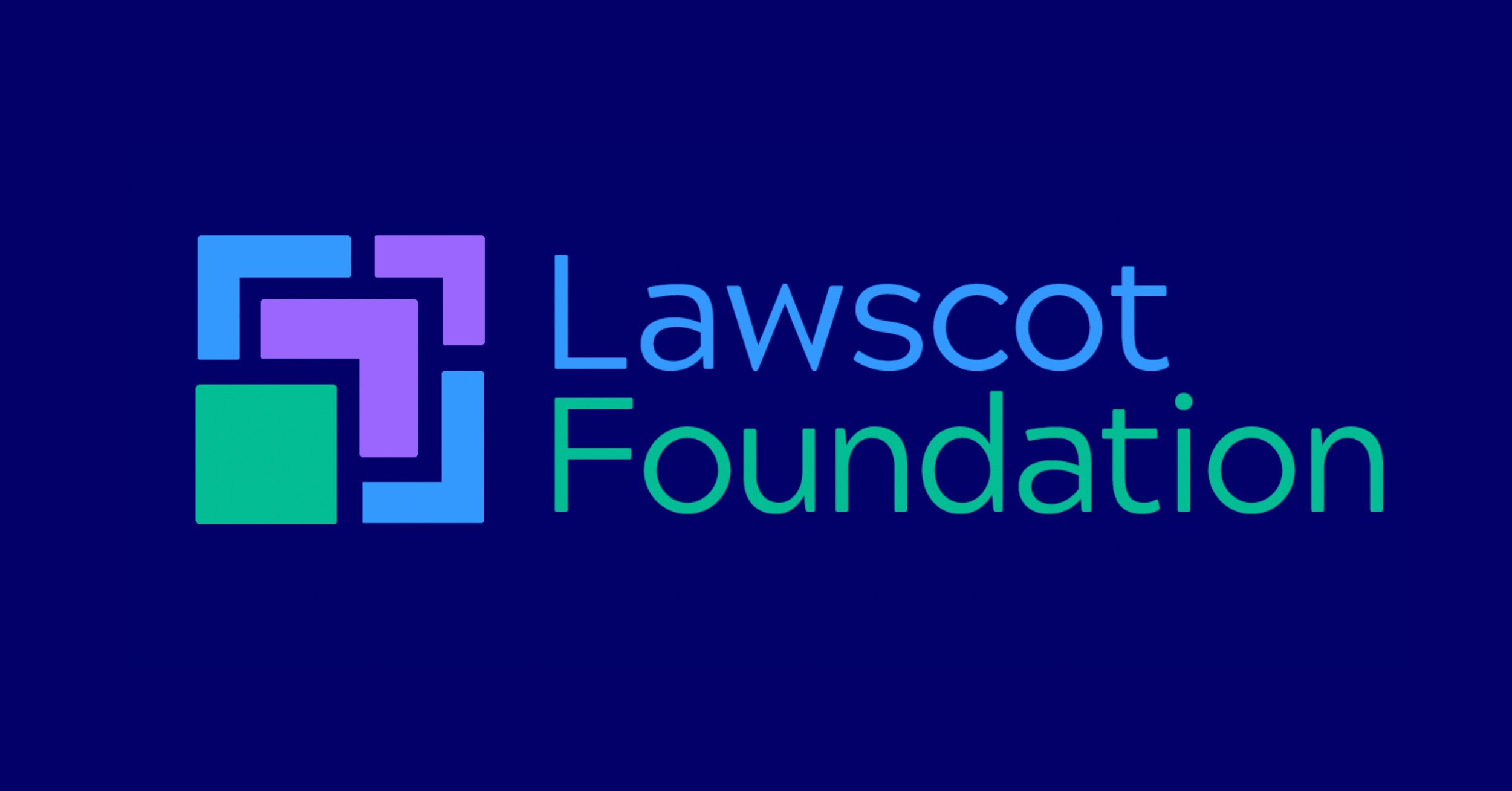
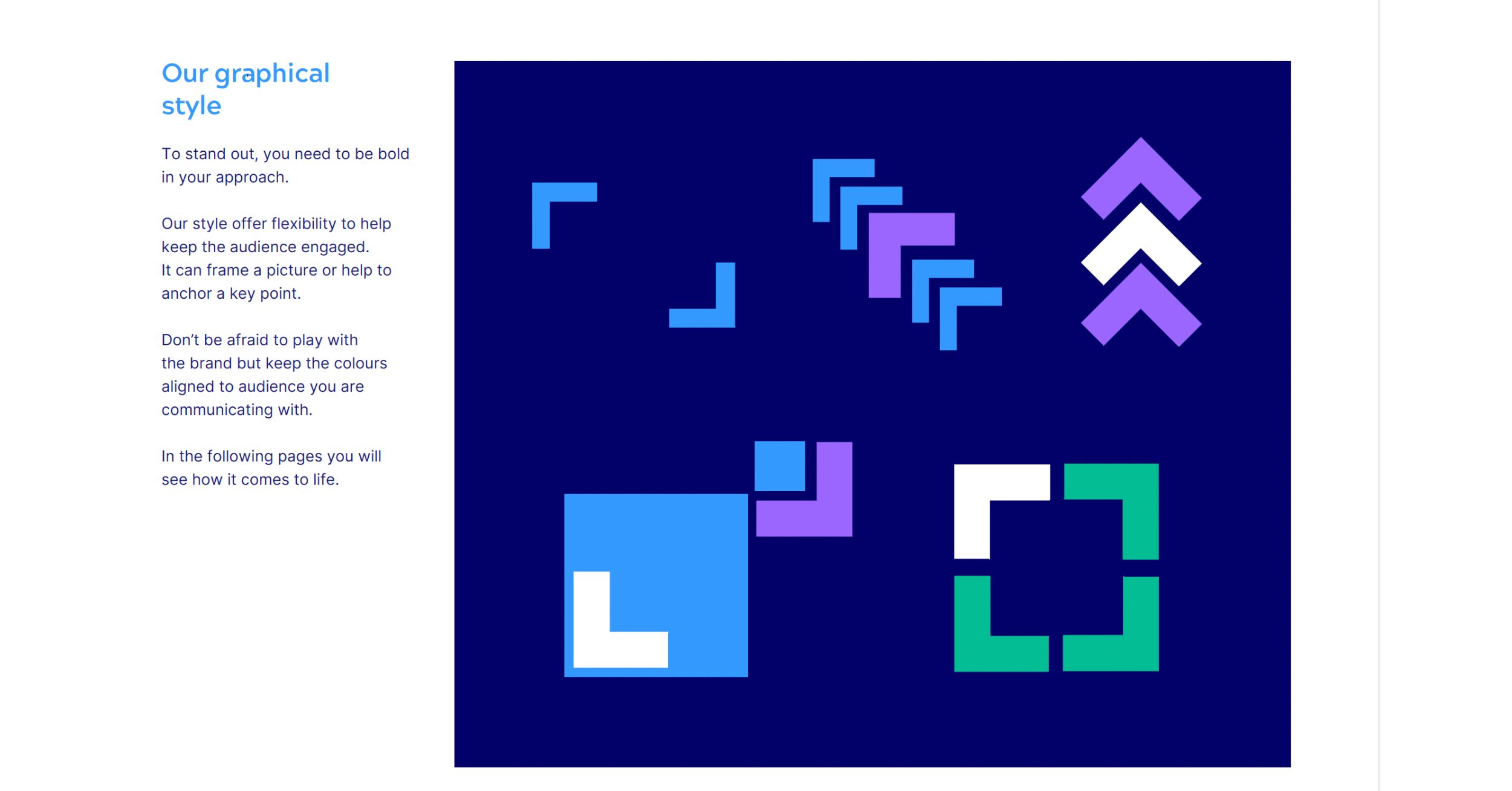
The visual identity followed: bold, playful, flexible, built around a graphical system that moves across digital, print, and social without losing its energy. A deep navy anchored by bright blue, purple and green. A brand mark that works across three distinct audience expressions: Our Future, Our Profession, and Our Supporters. Typography and photography guidelines that keep everything consistent without making it feel rigid.
The work was delivered as a full brand guidelines document covering purpose, vision, mission, values, tone of voice, brand mark, colour palette, typography and graphical system. Everything a growing charity needs to show up consistently across every touchpoint.
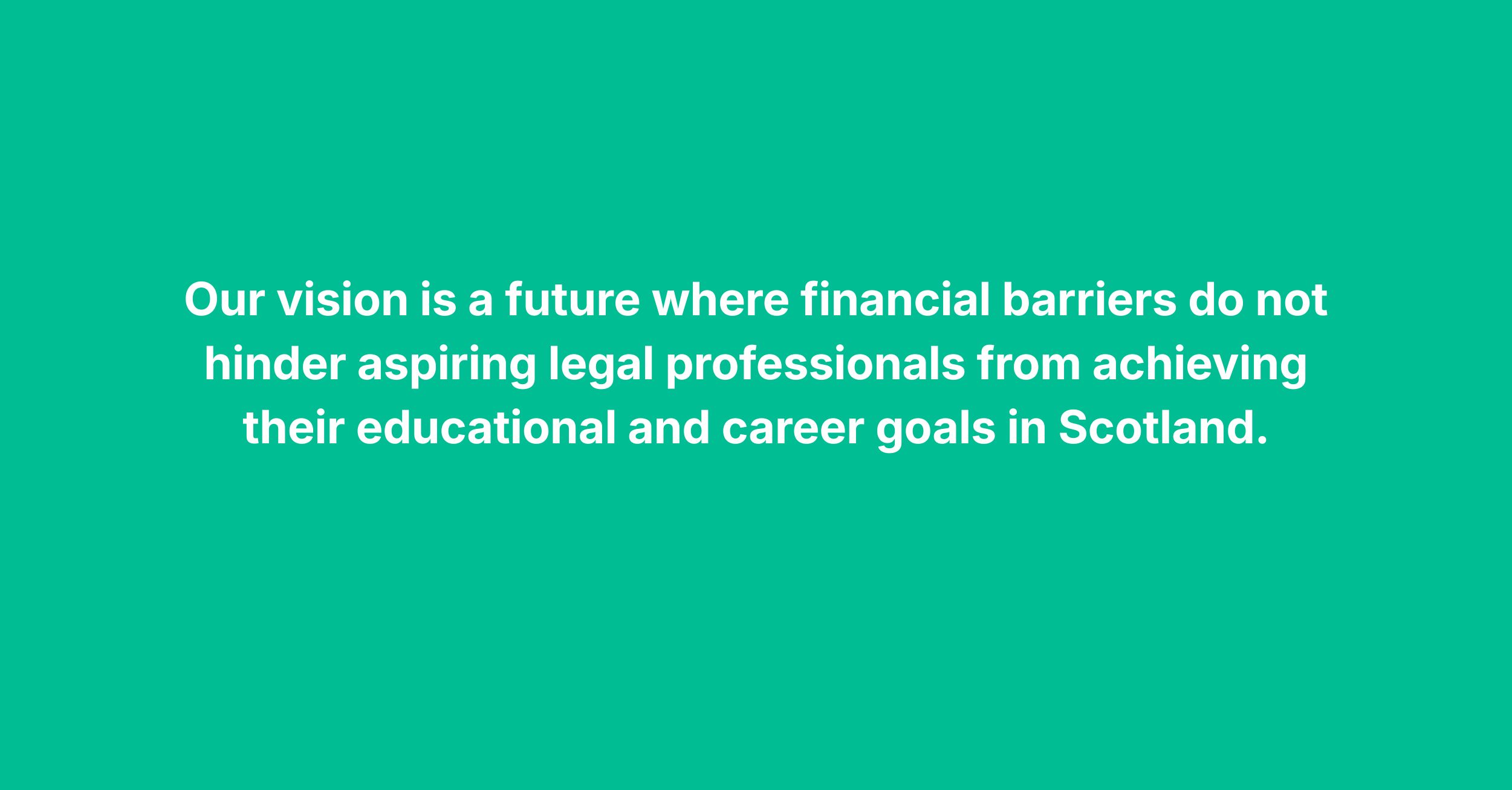
Our purpose is to help talented people study Scots law.
Simple. Human. Exactly right.
Social mobility is the story. The brand now tells it. Check it out here.
Services
Brand Strategy, Branding & Design