Lifelink WorkWell
A mental health organisation with 140 people, a strong reputation and a new ambition.


Lifelink had spent years building something genuinely valuable in the community mental health space. The next step was expanding into commercial workplace wellbeing training. A natural move, but one that needed its own identity. You can’t take a charity brand directly into a corporate environment and expect it to land the same way.
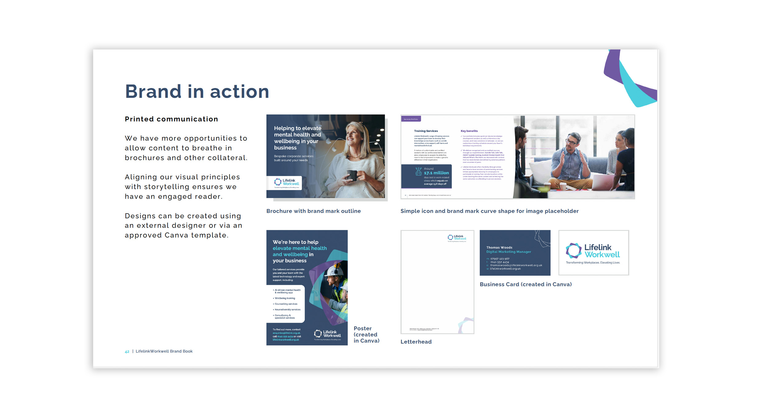
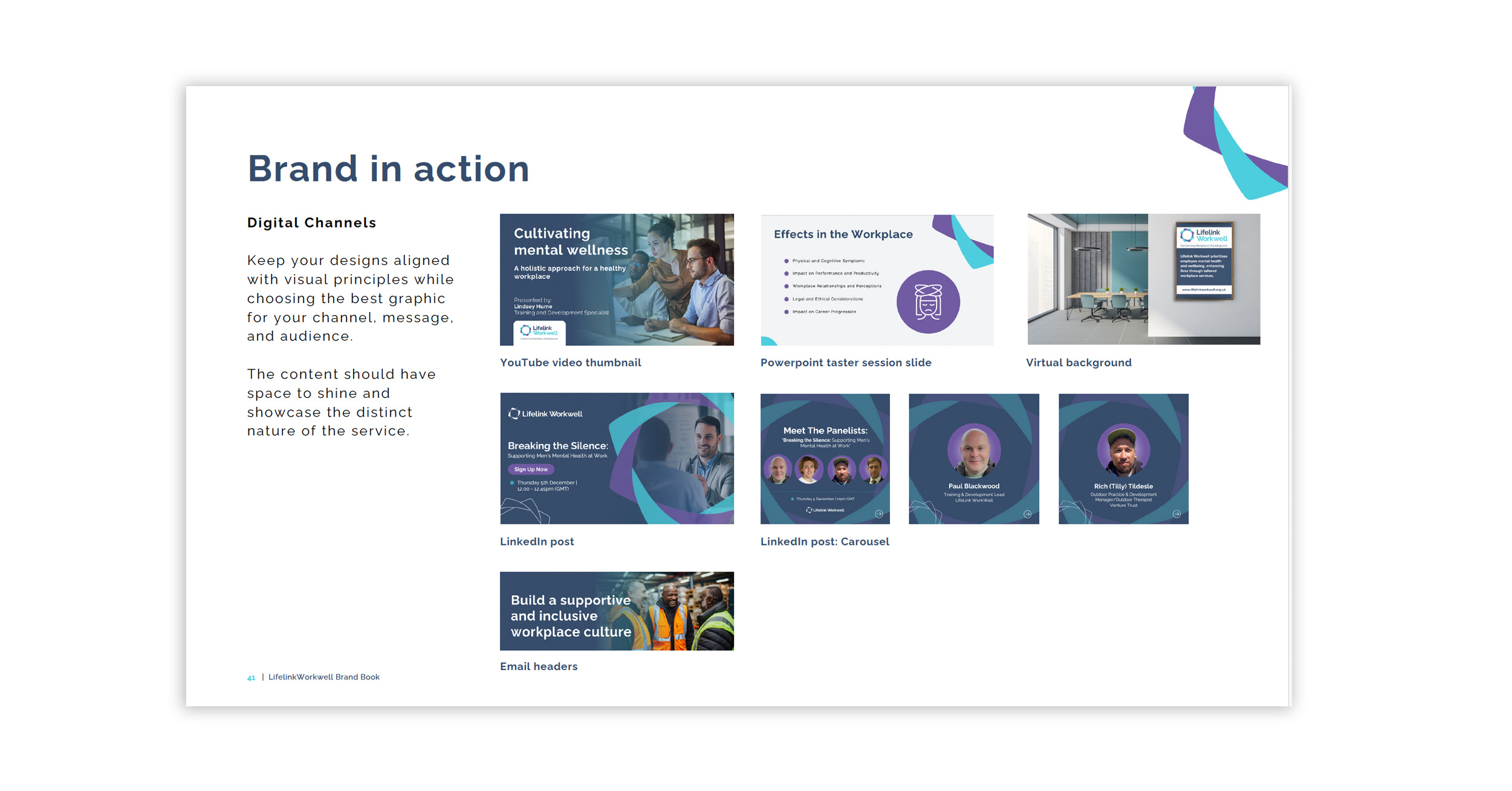
The brief covered everything from the ground up. Naming, brand architecture, visual identity, tone of voice, brand archetype, print and digital assets, style guide and toolkit. The goal was a sister brand that felt distinct enough to stand alone in a commercial setting, yet connected enough for Lifelink’s credibility to carry through.
WorkWell was the name we landed on. Clear, purposeful, and immediately understood by the people it was built for.
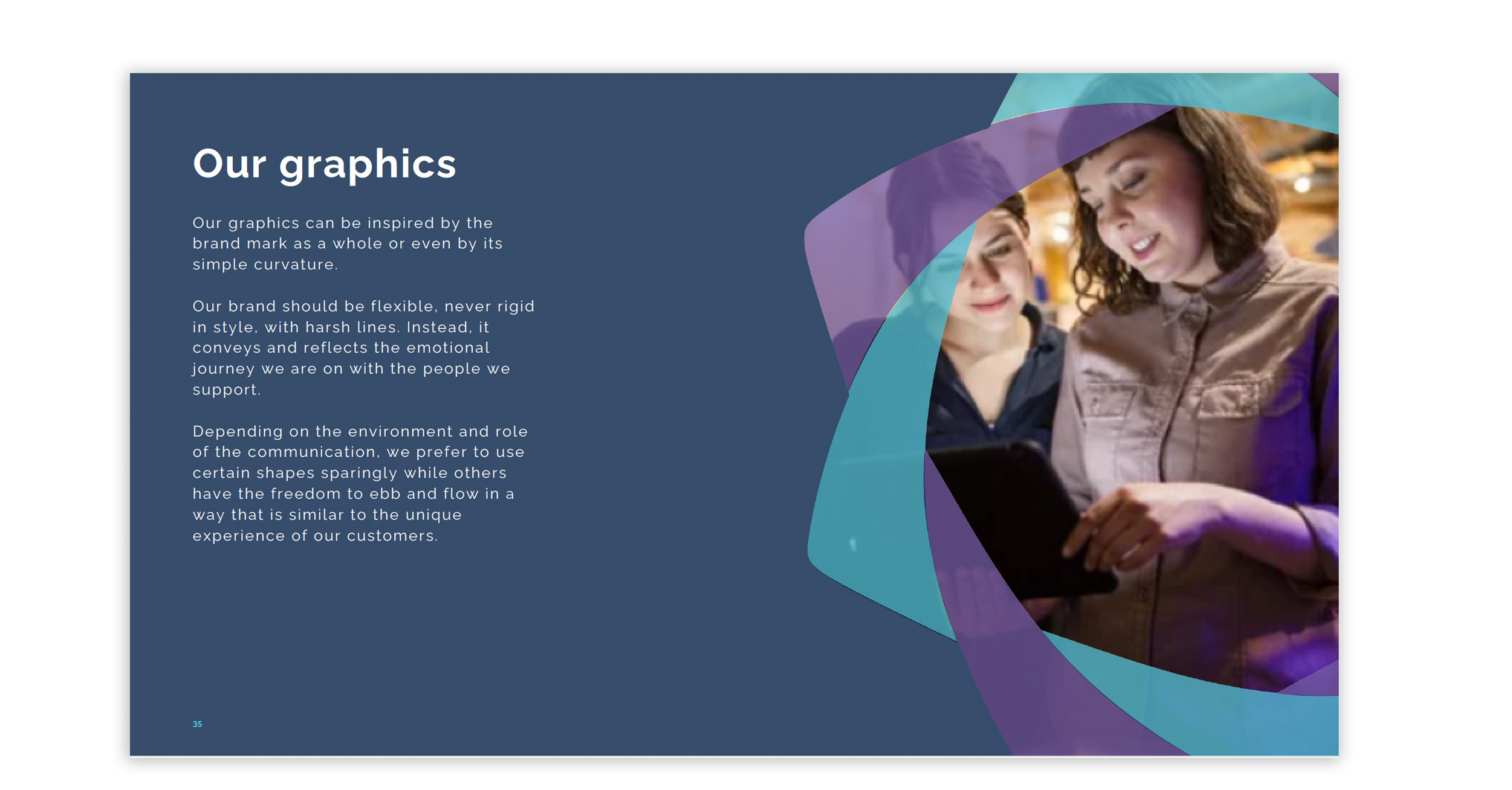
From there, every element was built to speak to a different audience. HR directors and people managers rather than community referrers. A tone that was warm but professional. A visual identity with its own personality but a shared set of values underneath.
A brand that earns its place in two different worlds at once.
Services
Brand Strategy, Branding & Design