
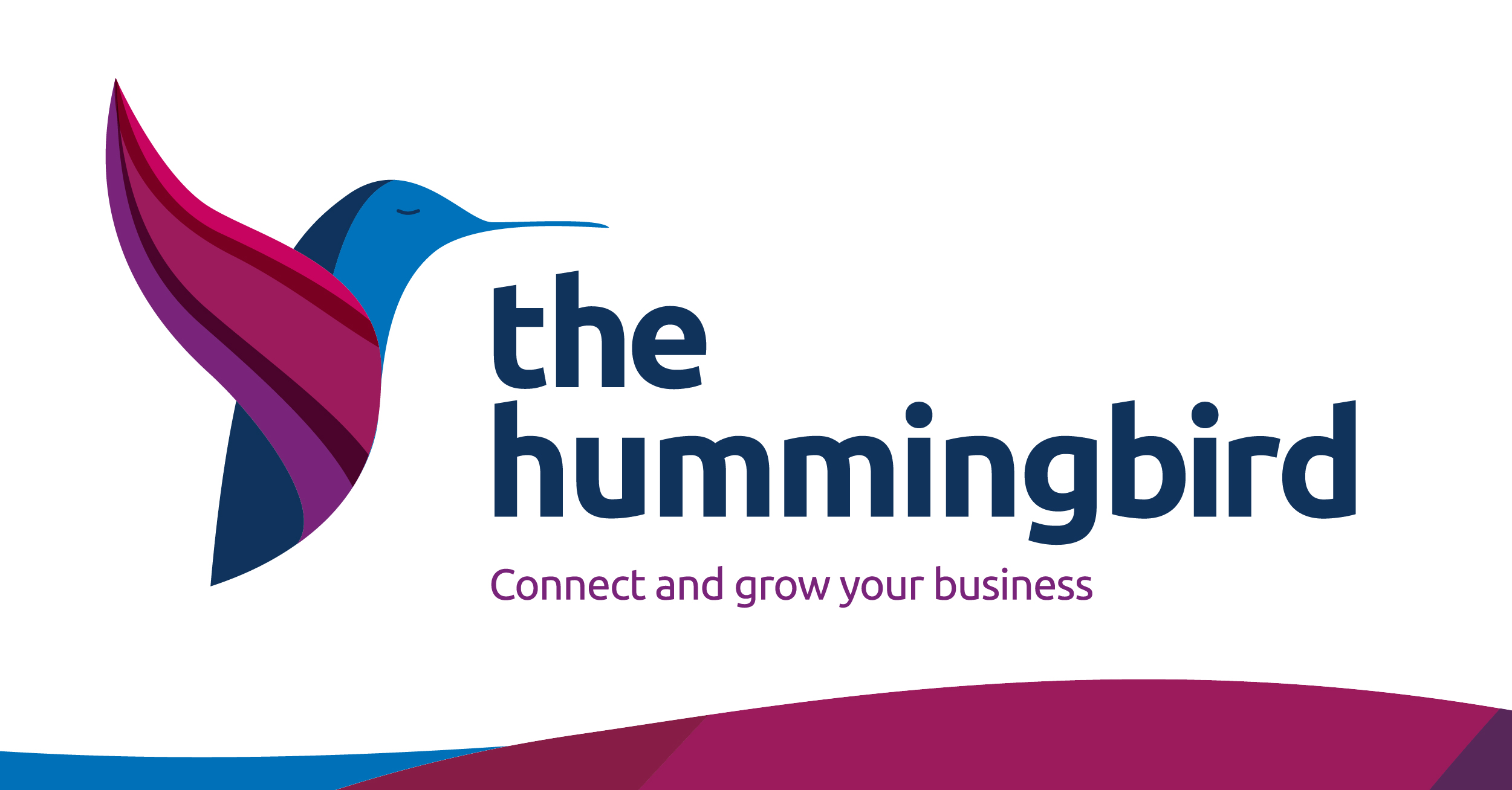
the hummingbird
A calm and resilient vibrant brand to help empower people and businesses.
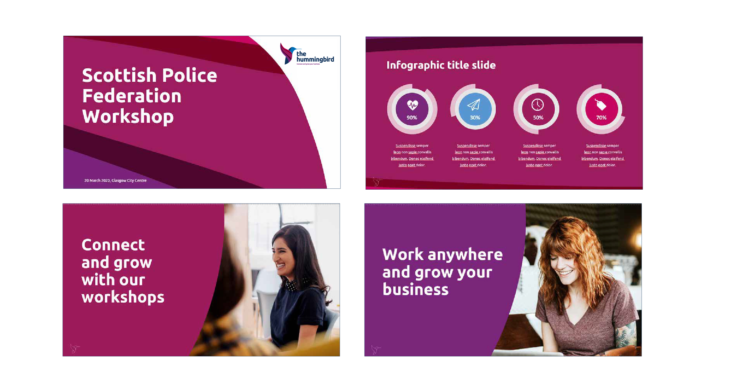
A LinkedIn coaching and training business operating in a noisy space. They needed a brand that felt calm, confident and credible from the first glance.
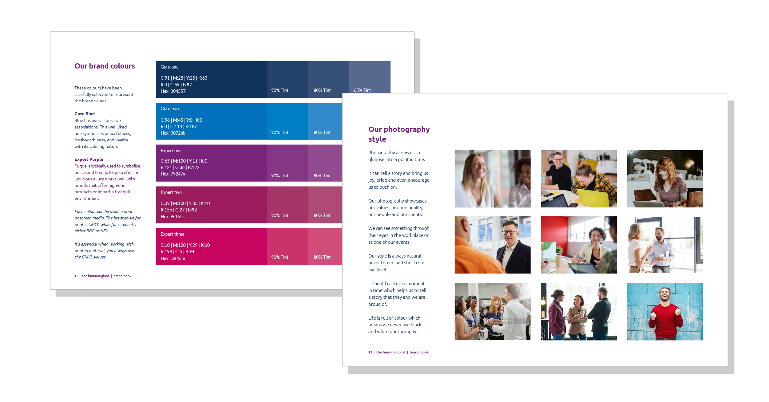
We anchored everything around the hummingbird archetype, that rare quality of moving with ease and precision even when the environment is turbulent. Bold typography, a vibrant blue and purple palette, and a brand architecture that connects naturally to their sister brand, the CV guru. The result is a brand that looks like it means business.
Check out their great work here.
Services
Brand Strategy, Branding & Design