
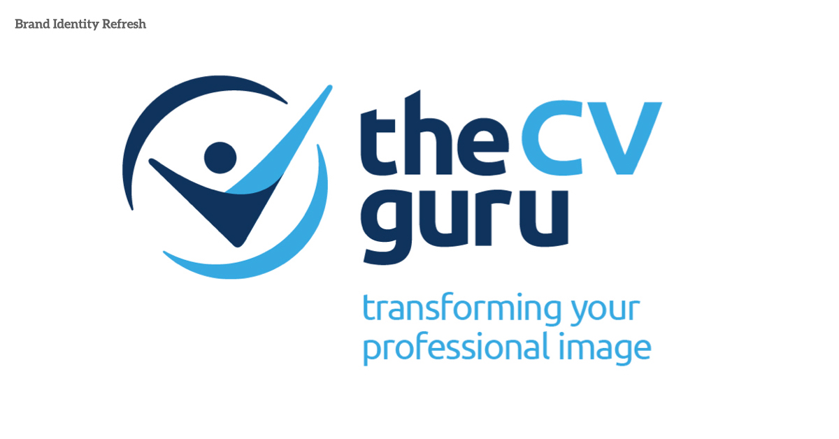
the CV guru
With any brand refresh, you have to be careful of the history and relationship customers have with the brand.
When the CV guru required such a refresh, we had to consider it’s an established name with a strong brand presence growing year after year. And second, any changes couldn’t damage the equity already held with the customer base.
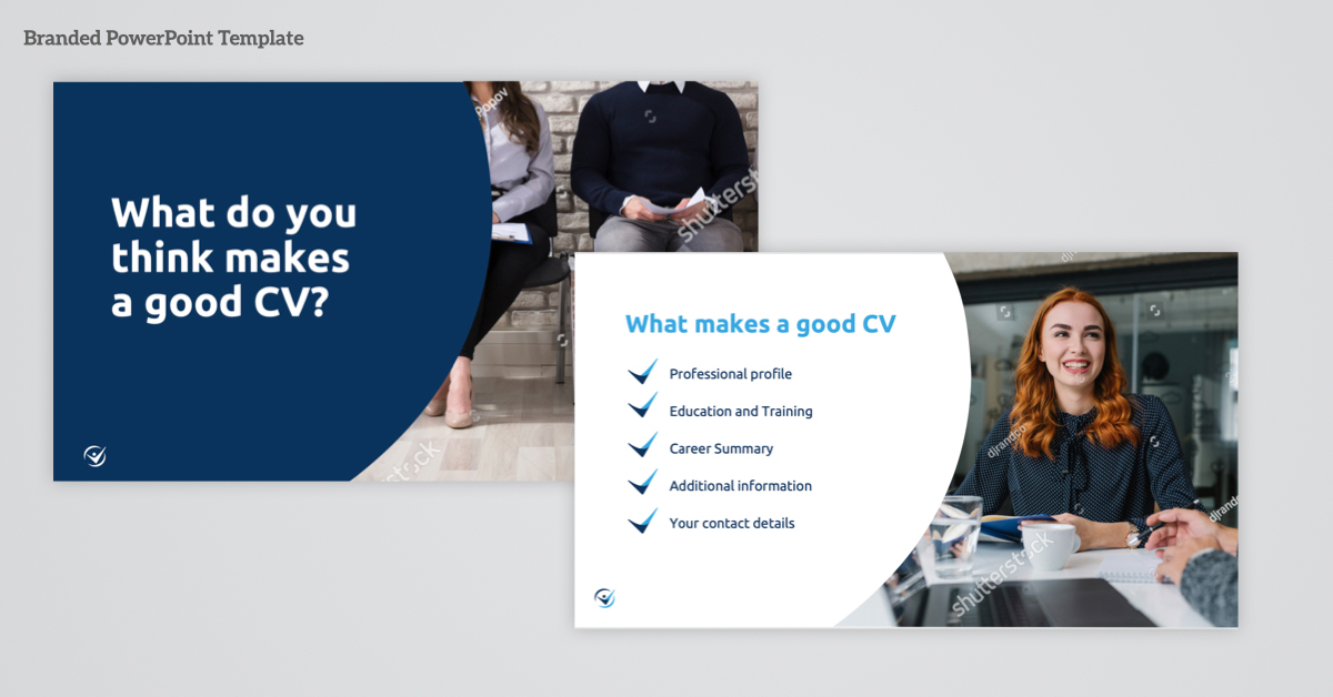
The CV guru help’s people to transform their professional image no matter the stage in their career. All done through professional CV writers to ensure nobody sells themselves sort and they move up the ladder of their choice. Plus, they regularly put out content on topics like ‘How to get ready for video interviews”. This caring aspect needed to come through the brand identity and brand DNA.
On top of this, we spent time reviewing the gurus brand aspirations to ensure we set the foundations for any other brands that might come under its wing. These included a brand font, colour phycology, and other elements that help bring subtle cues across the future brands.
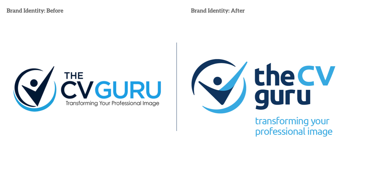
The existing identity concept was good; it just needed to be refined and evolved to suit the strategy above. The balance of the elements was off, meaning you didn’t feel as confident when in fact, you should feel uber confident in who you ask for help in making your next career move.
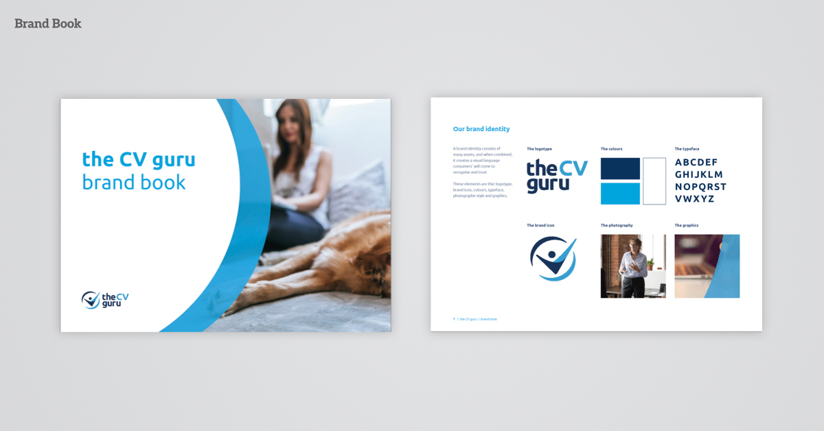
A new brand font was selected, adapted and refined. We then brought each word and letter closer together to reflect the customer and the brand’s synergy. We ensured each word worked better as a unit when used with and without the brand icon.
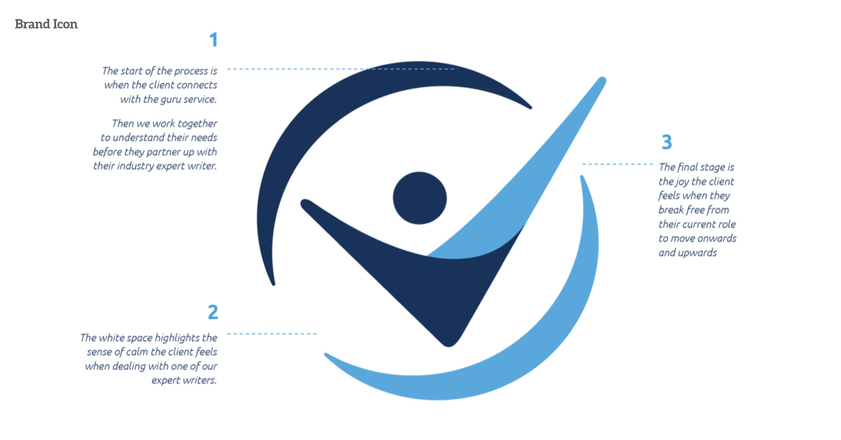
Next, we refined the brand icon. Again, the concept was good, but we thrashed out that it should be one journey the customer is on when considering the circles. With natural pauses or breaks throughout to help bring that sense of calm and time to think and plan their next move.
At the top of the circle/journey is where the guru supports the customer during the transformational CV stage. The light blue circle represents the customer moving around smoothly and back up through the journey to celebrate their new career stage in life.
Then we took this strategy and applied it to the hero with the circle, the customer. The relationship is highlighted, but we also altered the celebration’s width and smoothed the overall shape to be more welcoming.
Together these subtle changes help ensure customers who know the brand recognise the evolution while potential customers see a strong, confident and welcoming brand ready to support them on their next career move.
Check out their great work here.
Services
Brand Strategy, Branding & Design